If you want to give insight into the data your dairy gathers (to both client and therapist), then it is a good idea to make this visible in a graph.
As an intervention developer it is important to think carefully about which variables you want to show in a graph, and what the best visual output is. As up to now, there are 3 types of graphs possible. You can choose:
- Line graph
- Bar graph
- Scatter graph
| Line graph | Bar graph | Scatter graph |
 |  |  |
Create a graph in three steps
Follow the following steps to create your diary graph.
A graph always needs code editing. To be able to create a graph for your diary, you need to know the basics of javascript code editing. For this reason javascript code can only be edited if you have the roles 'editor' and 'release manager' in the CMS. If you don't have these roles yet, you can ask the application manager of your organisation to give you these roles. Of course we are also happy to do your javascript editing for you if it is not your ambition to learn this. If the latter is the case, please contact your account manager.
Step 1: design your graph in your head
Before you start to create your graph in the CMS, it is important that you think about what you want your graph to look like. What data from your diary makes sense to see a visual output of? What gives meaning to your diary? Are there 1 or more data-items you want to show in a graph? Also think about how often the client fills out the diary. Is it more often than once a day, then, for instance, you should think about whether you want to gather all entries of that day into a single datapoint in the graph or not.
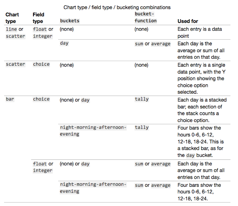
Keep in mind: a chart can only be defined for question-fields of the type 'choice', 'integer' or 'float'.
Step 2: type the standard code for graphs into the raw code of your diary
Click on 'Schema' to open your diary. Then click on 'Edit raw'.

Here you see the javascript code of your diary. It starts with {"fields" etc. Place your cursor at the top of the field. Press 'enter' a few times to create some empty space at the top of the field. Carefully copy the code - that is shown in the image below - onto your field.
| Code to make a graph | How it looks in the CMS |
| { "charts": [ { "buckets": "day", "series": [ { "bucket-function": "sum", "field": "asleep" } ], "title": "Hours of sleep per night", "type": "bar" } ], | 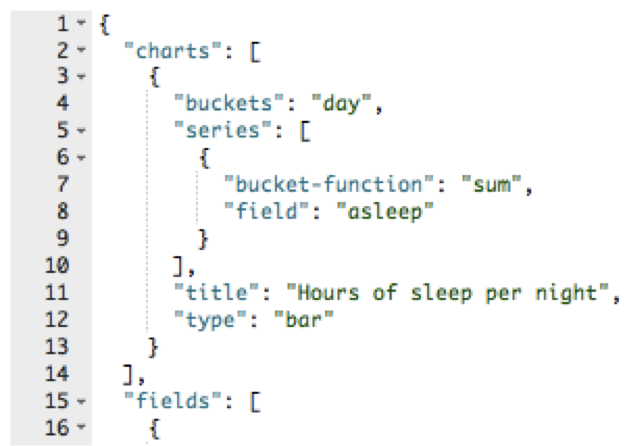 |
When you are working with code, it all comes to accuracy. If your graph doesn’t work, always first check if you forgot a comma, space or a quotation mark somewhere.
Step 3: replace the green text
Adjust the code to your diary by replacing the green pieces of text to fit your diary.
Title
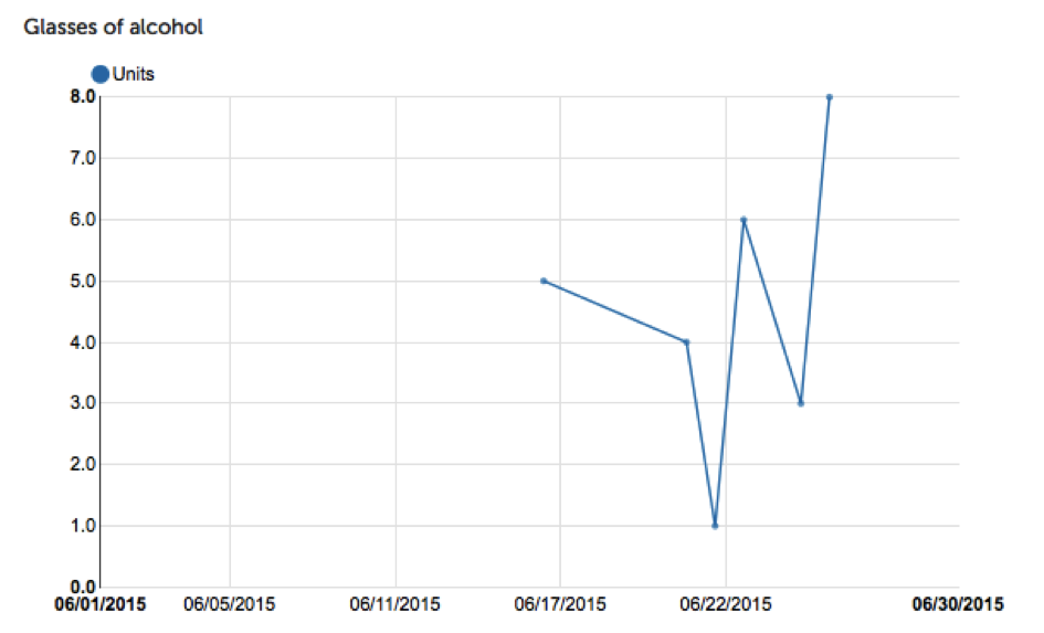
Even though this is not the first item you come across, it is the easiest one. So a good one to start with. What do you want the title of your graph to be? It helps to choose a name that is explanatory of what you are presenting in the graph. For example, 'hours of sleep per night' or 'number of alcoholic beverages per day'. The title will be displayed above (or near) the graph.
Type
Here you fill in the type of graph you want. You can choose from: "line", "bar" or "scatter".
Field
This refers to the field name of the question in your diary of which you want the data to appear in the graph. So type your fieldname here.
Buckets
The buckets function lets you collect multiple entries into a single data value in the chart. For example, "day" collects all values on the same day into a single data point. Or "night-morning-afternoon-evening" shows four data points, collecting entries from multiple days for each data point.
Series and bucket-function
The bucket-function on a series defines how a single data point is constructed from multiple entries. For example, for a field describing the amount of alcohol consumed in a single sitting, and with per-day buckets, the bucket-function "sum" is the most appropriate: it will show the total alcohol consumption per day. On the other hand for a field recording the intensity of an emotion the bucket-function "average" would be more appropriate. For choice fields the "tally" bucket-function counts how many times each option was selected, for display in a stacked bar chart.
Remind yourself to save your work frequently! The diary editor does not save your work automatically.
How to create more than 1 graph for your diary
This is quite simple. Add a comma at the end of your graph-code and copy+paste the graph code again into the field. Adjust the green text to fit this second graph you want to create and save. An example of what the code could look like with 2 graphs is shown here:
| Code to make 2 graphs | How it looks in the CMS |
| { "charts": [ { "buckets": "day", "series": [ { "bucket-function": "sum", "field": "asleep" } ], "title": "Hours of sleep per night", "type": "bar" }, { "buckets": "day", "series": [ { "bucket-function": "sum", "field": "restedfeeling" } ], "title": "Rested", "type": "bar" } ], |  |
What will the graph look like in the end?
When you are done with your chart, you can check with a test client in the platform to see what the chart finally looks like. Add the diary to a test client. Use the user switch and perform a diary entry from the client's perspective. Switch back to your own professional account. Go to the test client and then click on 'diary' and then 'Calendar & Charts'. If you then scroll down, you will see a chart (provided you have already done a diary entry as a test client, otherwise nothing will be visible!).

